Latest From Our Blog
Posted on April 6, 2017 by Mike W.
Last week we explained why displaying a full page popover immediately after a visitor arrives on your website is usually a terrible idea. But we acknowledge there are times when it is critical to get the user's attention right away. In such instances, we recommend using a partial popover of some flavor that does not inhibit the visitor from reading what they came for or chase them away from the site.
Posted on March 29, 2017 by Mike W.
In a world where people doing insane things is more and more common, we are hard pressed to think of a more insane marketing strategy than to show a full page popover IMMEDIATELY after a user arrives at a website. It's like punching them in face. The number of websites that utilize this strategy is actually scary. In almost all cases, the mistake is compounded because there is no Persuasive Free Offer (PFO) attached to the popover. It's just some lame attempt to get you to join their email newsletter. Ugh!
Posted on March 22, 2017 by Nathalia
New Inbound Marketing trends pop up all the time. (Pun not intended!) Recently, we've noticed an increasing number of websites that utilize two question or multi-page Popovers that only take up a small portion of the screen. This technique allows the site owner to segment data by asking two or more questions in a non-invasive way.
Posted on March 15, 2017 by Nathalia
Have you ever heard that a smile can take you a long way? Charisma and body language are present in everyday interactions, and play an important role in convincing or persuading others. The best sales people are those who provide a personalized and relatable experience to their customers, creating a connection and hopefully cultivating a new bond.
Posted on March 8, 2017 by Mike W.
We recently examined how news organizations such as CNN, the NY Times, and the Guardian utilize popovers to get people to pay for news content online. Each news organization could improve their popover by making simple changes. In this blog post, we layout a seven prong strategy any news organization could integrate into their Popover strategy to increase subscribers.
Posted on March 1, 2017 by Mike W.
The changing media landscape spawned fledgling business models and underscores the need for news organizations to monetize their website traffic. So it's no surprise they often use popovers to convert readers into subscribers. In this blog post, we examine the popover techniques and Persuasive Free Offers (PFOs) utilized by CNN, the New York Times, and The Guardian.
Posted on February 22, 2017 by Nathalia
When it comes to marketing your products, it is very hard to identify the best approach right away. It takes trial and error to optimize your marketing strategy. They say time is money, so it's beneficial for site owners to identify their optimal marketing strategy as quickly as possible. We've noticed that popovers amplify user behavior for better or worse.
Posted on February 11, 2017 by Mike W.
We've all responded to online offers by handing over our precious email address only to end up with some dubious "benefit" that raises more questions than answers or creates more problems than solutions. We can do better. A frustrating "bate-and-switch" experience is not conducive to building trust or transacting future business. That's why the Persuasive Free Offer (PFO) in your popover must strike the right balance.
Posted on February 4, 2017 by Nathalia
Attracting customers with the word FREE is a technique as old as marketing itself. The prospect of getting "something for nothing" makes people more likely to engage and imparts a subconscious need for them to give back. What formula can site owners use to craft their Persuasive Free Offer (PFO)? To woo new customers with a PFO, site owners must address three challenges...
Posted on January 27, 2017 by Mike W.
No matter how your visitors discovered your site, you have only a small amount of time to connect with them before they leave. Therefore, it's critical to make your Persuasive Free Offer (PFO) super obvious so they don't miss it. It's not possible (or legal) to grab the visitor by their collar and shake them. So what can we do instead to get their attention? In this post, we describe three ways to make your PFO super obvious.
Posted on January 20, 2017 by Nathalia
Everyone loves free stuff. That's no secret! But how can a site owner give away something valuable without going broke? Below, we describe five types of Persuasive Free Offers (PFOs) to strike this balance. And the last three won't cost you a dime!
Posted on January 13, 2017 by Mike W.
In recent years, responsive design techniques enabled web developers to create websites that look good across the entire spectrum of devices from laptops to tablets to phones of all sizes. So, in that way, websites are "smarter" than they used to be. But what we predict in this case, looking ahead to 2017, is that more websites will tap into the emotional needs of visitors and build trust more quickly.
Posted on January 6, 2017 by Nathalia
At the end of last year, we predicted that site owners would develop a more cohesive inbound marketing strategy. To achieve this aim, it is helpful to divide your inbound marketing program into distinct parts. Let's examine the five parts or "gears" that can make or break your inbound marketing strategy. Much like gears in a machine, one part won't work until the others are properly adjusted.
Posted on December 30, 2016 by Mike W.
As 2016 comes to a close, it's time to look forward to the new year. What inbound marketing trends will emerge (or continue) in 2017? We identify the five most compelling trends on our radar that will affect our clients and guide our product development over the next 12 months.
Posted on December 23, 2016 by Mike W.
Readers of this blog know that recent posts describe how Flash Polls are used. Most recently, we examined how Amazon, Facebook, and Google utilize Flash Polls to learn about their users' behavior. Today, we examine how one of our clients, the We Get Around Network, implemented a series of Flash Polls and what conclusions were reached.
Posted on December 14, 2016 by Nathalia
In this post, which continues our recent theme of Flash Polls, what they are and what insights they can deliver, we examine how Amazon, Facebook, and Google utilize Flash Polls.
Posted on December 12, 2016 by Nathalia
Last week, we examined the concept of a Flash Poll, in which a site owner prompts their visitors with a simple question. The goal is to help the site owner engage their visitors in a meaningful way and quickly gather results. But why would site owners want to do that? To answer this question, we offer five specific ways that Flash Polls can provide insights to site owners
Posted on December 8, 2016 by Nathalia
Why do we often prefer social media over "regular" websites? One reason is that social media feels "alive" while most websites read like boring brochures. Social media is an experience that people savor and regular websites are lame by comparison.
Posted on December 1, 2016 by Nathalia
Who doesn't enjoy a warm welcome? Whether you're greeted as you walk into a store, welcomed to a fancy hotel, or returning home after a long day, a pleasant greeting is guaranteed to put a smile on your face. It's a gesture offered with no obligation and no strings attached. (No pressure!) At the same time, it opens the door to further discussions.
Posted on November 22, 2016 by Nathalia
Exit Intent Popovers are sometimes criticized because experts say it's more effective to show a Popover sooner rather than later. We agree; we think it's better to curry favor early on in most situations. But is there anything more puzzling for a site owner who finds that users get to the 'Confirm Order' page and then disappear forever before they place their order?
Posted on November 18, 2016 by Nathalia
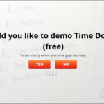
The Time Doctor website asks visitors simple questions (1 & 2). The questions are designed to be answered affirmatively, which leads the user to an invitation to try Time Doctor’s software for free (3). If the user accepts it, the following popovers ask for more information (4) and to start installation (5).
Posted on November 14, 2016 by Nathalia
Some websites utilize Exit Intent Popovers to prevent visitors from leaving their site. We admit there is indeed some upside to Exit Intent Popovers. If not, they would not be used at all. But it's not feasible to show too many popovers and our experience (and others' experience) indicates that conversion rates are significantly improved when the Popover is displayed at page load or shortly after. Here’s why Exit Intent Popovers disappoint.
Posted on November 10, 2016 by Nathalia
Upon opening ESPN.com, a popover advertising products from Home Depot takes over about one third of the page (1a). The ad contains a "close" option in the top right corner, but it recedes to a horizontal banner format within a few seconds (1b). The message in the popover is reinforced by two vertical banners (2) and a rectangular ad further down the page (3).


